Melbourne Sports Team Portraits with Cinematic Color and Bold Composition
There is a particular kind of quiet right before a team portrait session really starts. The athletes are still moving, still bantering, still adjusting sleeves and shin guards like the day has not fully settled into “photo time” yet. Then the first set of lights clicks on, someone checks their placement in the lineup, and the energy shifts. You can feel it in the room or on the field, especially here in Melbourne, where weather can switch mid-sentence and the sky can look like it has a grading filter applied to it.
Sports team portraits are often treated like a mechanical task: line up, shoot, deliver. I do it differently. When you want portraits that feel cinematic and bold, you build the scene first, then you work the athletes through it. The camera becomes a tool for storytelling, not just documentation. That approach is what separates a routine team photo from something people actually hang in offices, pin in club newsletters, or share at the start of a season.
This is a practical look at how I create Melbourne Sports Team Portraits with cinematic color, strong composition, and a workflow that respects the realities of sports schedules, logistics, and athlete preferences. If you are searching for a photographer in Melbourne who can handle both the craft and the timing, this is the mindset behind it.
The “cinematic” look is mostly decisions, not filters
Cinematic color does not mean “orange and teal everywhere.” It means intentional contrast and believable tonality. It means you control what the viewer’s eye lands on, then you keep the skin tones consistent enough that the final image looks real, even if the mood is dramatic.
In practice, that starts before the shutter. I plan for three things:
First, I decide how I want the light to behave. Are we going to lean into the warmth of late afternoon, or do we want a cooler, stadium-like atmosphere with punchy contrast? Melbourne gives you both options in a single week, sometimes in a single day.
Second, I choose the background strategy. A cinematic frame needs separation. If the background is busy, the mood collapses into “busy.” If it is too clean, it can feel sterile, like a passport photo in sports kit.
Third, I decide how bold I want the composition to be. That is where “team portrait” becomes something more interesting than a straight-on lineup. I still show everyone clearly, but I frame like a director, not like a clerk behind a counter.
The color comes from the decisions, the lighting supports those decisions, and editing just refines the intent.
Bold composition without losing the “team” in team portraits
A lot of photographers default to flat, symmetrical framing because it seems safest. Symmetry is not wrong, but it can be uninspired. The trick is to introduce dynamism while keeping the image readable and fair to every player.
When I’m composing Melbourne Sports Team Portraits, I think in layers. The first layer is faces and eye-lines. The second layer is bodies and kit lines. The third layer is environment and negative space. You can make the third layer cinematic without letting it swallow the first two.
A few composition moves consistently work:
- Create diagonal lines using posture, stance, and arm angles, so the frame has a direction.
- Use mild camera elevation or slight downward angle, so the team reads as confident rather than crowded.
- Leave controlled negative space near the direction of gaze, so the viewer’s attention flows naturally across the image.
- Vary depth by placing two athletes forward and others slightly behind, even if everyone stands in roughly the same footprint.
This does not mean you can ignore standard portrait concerns. You still need everyone’s faces visible. You still need jerseys and numbers readable. But you are allowed to be creative within those constraints.
The athletes notice this too. When the composition is strong, they stand differently, even before you tell them how. It becomes easier to direct them, because the “shape” of the image is already clear.
Lighting that feels like a film still, but behaves like sport
Lighting is where most team portrait sessions either become memorable or turn into a struggle. Stadium lights can be harsh and uneven. Indoor gyms can be fluorescent and flat. Overcast days can be beautiful but unforgiving if you shoot at the wrong time of day. Wind and cloud cover can ruin your warm glow plan in less than five minutes.
So the lighting approach has to be flexible. Cinematic color usually means you want contrast, but contrast in sports portraits can make exposure tricky, especially when faces are darker than jerseys or vice versa.
On location around Melbourne, I plan around two broad lighting goals:
- Separation: keep players crisp against a background that is not competing for attention.
- Consistency: make skin tones and uniforms look stable across multiple frames, because team sets tend to include small adjustments in expressions and posture.
For outdoor sessions, I often work with a blend of natural light and controlled fill. If the sun is cooperating, I’ll use it as the “key” and add a comparatively softer fill to protect faces from going too deep. If the sun is fickle, I might shift to a more lit look entirely, using portable lights to create the sense of a main highlight and a slightly darker, cinematic mid tone.
Portable lighting also helps you make the session efficient. Teams are rarely patient for long bursts of “let’s try one more setup.” Most clubs have a tight window, and athletes might have training or travel right after.
A quick, honest note on gear choices
I’m not going to pretend the same setup works for every ground. The real-world differences between an indoor stadium, a suburban oval with power lines, and a street location behind a warehouse are huge. But I do pay attention to certain practical factors.
For tight group work and face clarity, lenses in the 70 to 135mm range are common tools. For more dramatic framing, you can go wider, but wider lenses increase distortion if you’re too close. If you want bold composition with minimal weirdness around noses and shoulders, staying moderate on focal length saves headaches.
A camera that handles skin tones well under mixed lighting also matters. You will often be mixing daylight with light from signage, overhead fluorescents, or street sources. The best “cinematic” result comes from controlled capture, not from an overly aggressive edit after the fact.
Melbourne locations: the atmosphere you can build into the frame
Melbourne can look cinematic by accident. Brick walls, industrial textures, faded concrete, eucalyptus lines, and that particular quality of coastal light that shows up even when you are not near the water. The challenge is choosing backgrounds that support your team, not backgrounds that compete with it.
For sports team portraits, I prioritize locations that offer at least one of these:
- A clean separation line (trees, a fence edge, a wall plane) that can blur softly.
- A reflective or textured surface that can hold cinematic color without turning chaotic.
- A backdrop that provides “context” at a glance, like a stadium facade, a goal frame, or a training ground feature.
Sometimes the best location is not the fanciest. A plain field edge with controlled light is better than a visually busy spot that forces you into awkward angles. When you shoot for a team audience, clarity beats novelty every time.
Weather in Melbourne deserves its own paragraph. If it starts raining, the mood can become gorgeous, but only if you are ready. Wet asphalt can create contrast and reflections, and that can amplify the cinematic feel. But it can also spill light into backgrounds and create glare on shiny kit materials. I plan for it by keeping an eye on surface reflectivity and by positioning the team so highlights land where you want them.
Directing athletes so the final portrait looks effortless
Here is a truth that keeps my sessions moving smoothly: athletes respond best when direction is specific, short, and physically grounded. “Look stronger” is vague. “Chin down slightly, shoulders back, and look to the right of the lens” is executable.
A team portrait can fail when everyone is trying to “pose for a photo” instead of settling into a coordinated stance. So I direct body language in a way that supports the composition you already built.
I start with the center figures and build outward. If the captain or front row is composed well, the rest of the team naturally falls into the same visual language. Then I handle hands, because hands are where portraits often go messy. Jerseys bunch, fingers grab straps, arms drift into awkward positions. A quick adjustment in arm angle can make a frame look polished rather than incidental.
Expressions are the next layer. For cinematic portraits, “neutral serious” often wins for sports teams. Overly forced smiles can look like a marketing banner. But a dead stare also feels cold. I aim for focused confidence. I ask athletes to think about something that matches the intensity of their sport. It could be a specific training moment, a rivalry, or simply the mindset they bring to a tough match.
That is also where color and lighting help. If you expose well for faces and keep contrast controlled, you get expressions that look natural even under dramatic lighting.
Exposure strategy: what you get wrong at first, and how you fix it
The most common technical mistake in team portraits is inconsistent exposure between frames. You adjust one setting, shoot the first group, then the next group looks slightly different because the background changed or the light shifted behind a cloud. With cinematic color, those inconsistencies become obvious in editing because color grading becomes patchy across the set.
So I watch for:
- How skin tones sit relative to mid tones in the jersey fabric.
- Whether highlights in numbers or glossy sponsor patches are clipping.
- Whether the background brightness is shifting as people move.
If I suspect the light is unstable, I will lock exposure settings and rely on small pose changes rather than chasing exposure every minute. You can still create variation by adjusting how the athletes angle their bodies and where they look, which keeps the set dynamic without changing the lighting math.
A realistic target for shutter speed depends on movement and how steady the team is. With modern stabilization and careful timing, you can keep things sharp at speeds that are comfortable in outdoor light. Indoors, you may need to go higher to avoid motion blur from breathing and micro-adjustments. The goal is consistent sharpness across faces, not just “sharp enough” for one row.
When the plan changes: rain, wind, and timing pressure
Some of my best Melbourne sports team portraits happened because the original plan broke. Cloud cover thickened. Wind lifted loose hair and made kit fabric move. Someone’s shoelace came loose. A coach needed the team back on the field in ten minutes.
The question is not whether disruptions happen. They will. The question is whether your workflow handles them gracefully.
Here is the approach that saves you when time compresses:
First, you decide what “must-have” looks like. For a team set, I treat three images as non-negotiable: a hero frame with the strongest composition, a secondary frame with different energy, and a clean version where the faces are evenly readable for sharing.
Second, you streamline setups. If you planned three lighting variations and the weather turns, you choose one lighting style that holds up in the new conditions and you shoot faster within it.
Third, you communicate changes clearly. Athletes are rarely frustrated by a new plan. They get frustrated by unclear instructions. If you say “we have ten minutes, we’ll do two frames from this angle and then we’re moving,” most teams snap into focus because they can feel the structure.
That structure is part of the job of a sports photographer, not just the technical part. Melbourne schedules are real, and clubs need a photographer who can deliver under pressure.
Editing for cinematic color, without making jerseys look wrong
Editing is where the “cinematic” part becomes a finished look, but it can also ruin accuracy if you chase drama too hard. Team uniforms are often saturated with sponsor colors. Some fabrics reflect light differently than skin. If you oversaturate, you can make skin look sunburnt and sponsors look neon.
My grading approach is usually conservative at first. I correct exposure and white balance with intent, then I shape contrast. Cinematic color usually comes from controlling contrast and the relationship between warm and cool tones, not from pushing saturation everywhere.
A common problem is mixed lighting. Indoors, you might have daylight from windows and fluorescent light overhead. Outdoors at dusk, you might have warm ambient light and cooler shadows. The fix is not just “white balance sliders.” It is also about selecting how much warmth and coolness you keep, and whether you protect skin tones even if that means the background looks slightly less dramatic.
I also keep an eye on consistent skin texture and shadow detail. If you add too much contrast, faces can lose depth and look artificial. When the goal is a film still, depth matters.
When the set is ready, I do final checks on a few things: numbers, sponsor logos, and the clarity of eyes. Teams share portraits widely, and if the logos are too soft or the numbers are washed out, the image loses value quickly.
A practical workflow for Melbourne team portrait sessions
Most clubs care about delivery speed and a smooth experience. The artistry matters, but the session itself has to feel professional and efficient.
I usually plan the timeline around how many people are in the group, how complex the poses need to be, and how responsive athletes are to direction. A smaller squad can move quickly. A bigger team with multiple age groups or a tight schedule may require more incremental frames.
Below is a short checklist I use before showtime. It keeps the technical stuff from stealing time from the athletes.
- Confirm location access and any restrictions (power, timing, public areas)
- Identify lighting conditions and backup options for weather shifts
- Set expectations with the club on kit, numbers, and any sponsorship clarity needs
- Prepare lens and light choices for the likely crowd size and space
- Share a simple plan with the captain so the lineup happens fast
If a coach wants something specific, like a particular lineup order or a certain vibe for a finals series, I incorporate it. If they want “cinematic but still clean and respectful,” that is a manageable target. If they want “dramatic and also every number readable at arm’s length,” that is also possible, but it requires more discipline with exposure and composition.
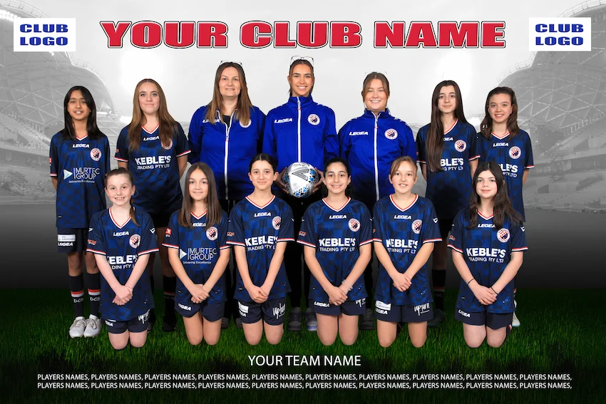
Color and composition ideas that work for real sports teams
Every team has a personality. Some squads want intensity and aggression. Others prefer calm confidence. Some clubs lean toward modern, minimal style. Others want something that feels gritty and traditional.
Rather than forcing one aesthetic onto every Melbourne Sports Team Portraits job, I tailor the treatment. Here are a few cinematic directions that translate well for sports:
1) Warm dusk confidence
This is the “season start” mood. The light is warm, skin tones look flattering, and the background fades into richer mid tones. I keep the composition bold, usually with slight diagonal staging and confident eye-lines.
2) Stadium cool drama
This style leans into cooler tones and deeper shadows. It works especially well for teams that want a harder look. The key is not to crush skin tones, because cool grading can make faces look too dark if you do not manage exposure carefully.
3) Overcast soft power
Melbourne overcast can be a gift. You get even light without harsh highlights. The cinematic effect comes from contrast shaping, background separation, and directional posing, not from relying purely on sun.
4) Rain reflections and controlled highlights
When surfaces are wet, reflections can add energy. I position the team so glare does not blow out faces and sponsor patches. The result can look like a music video still, but only if the exposure is disciplined.
If you want, I can match the team’s existing branding palette, but I still prioritize skin tone integrity. Sponsors matter, but people are the subject, not the logos.
The one thing teams rarely ask for, but always need: a coherent set
A single hero image is great. A coherent set is better.
Sports clubs usually need more than one portrait. They might need a hero for social media, a clean lineup for a website header, and a couple of mood frames for press releases. The set should feel like it came from one visual world, not like a collection of random shoots.
That coherence shows up in consistent exposure, consistent skin rendering, and a consistent “color philosophy” across frames. Even if you vary composition, the overall palette should feel like it belongs together.
When you deliver that kind of set, you earn trust. Coaches stop worrying about whether the next tournament photo will look off. Athletes feel proud, not self-conscious, because the portraits look polished in a way they recognize as intentional.
A closer look at lens and framing choices for group portraits
There is a practical balancing act in team photography. You want a wide enough view to include everyone, but wide lenses can distort faces if you shoot from too close. You also want enough depth to keep multiple rows sharp, but too much depth can make backgrounds look flat.
In Melbourne, I often use a strategy that lets me keep faces flattering while still feeling expansive. Moderate focal lengths help preserve natural proportions. Camera height and subject distance become the hidden “lens correction” you can actually control on location.
Also, you do not need to shoot every team in one configuration. If you have the space, a second framing pass can be more valuable than a third attempt at the first idea. Sometimes moving the camera back a step and shooting the same lineup with a slightly different angle creates a totally different feel, without requiring a full reposition.
That is another reason I emphasize composition planning. If you know where the camera will sit, you can direct the team faster and you will get better results with less chaos.
What to expect if you hire a Melbourne sports photographer
If you have not done one of these sessions before, it can help to know what “good process” looks like from the other side of the camera.
A strong sports photographer should manage three simultaneous realities: the athletes’ time, the lighting conditions, and the final delivery needs. They should also be comfortable directing people who are used to training routines, not modeling.
You should feel guided, not rushed. You should get a clear sense of where to stand, when to change expression, and what you are aiming for in each frame. That guidance reduces the number of retakes and makes everyone look more confident.
And if weather shifts, you should feel calm, because the plan changes in a controlled way instead of turning into guesswork.
That is the experience I aim to provide when I photograph team portraits in Melbourne, especially when the goal is Melbourne Sports Team Portraits with cinematic color and bold composition.
Final frames should look like the season, not just like a day
A team portrait is more than “a photo of a bunch of athletes.” It is a snapshot of identity. It can signal momentum at the start Home page of a campaign. It can celebrate a group’s cohesion. It can capture that moment when everyone is focused and ready.
When you approach portraits like storytelling, the images stop feeling generic. The color feels intentional, the composition feels confident, and the athletes look like themselves, just elevated.
If you are planning sports team portraits in Melbourne and want a cinematic look with bold composition, the most important thing is to treat the session as creative direction with a technical backbone. The best results come from planning, decisive lighting, athlete-friendly direction, and a grading approach that protects skin tones and uniform integrity.
That is how you end up with portraits that do not just sit in a gallery. They live on jerseys, club walls, and season announcements, and they still feel right months later.
Pure Sport Images
23 Grandview Ave, Mulgrave VIC 3170, Australia
+61 413 157 614
[email protected]
Website: https://puresportimages.com.au/